CreateByte
The all-in-one platform that helps micro businesses build an online presence more efficiently.
Overview
CreateByte is an app that was developed to help micro business owners scale their business and online presence quickly and effectively by combining a variety of complex marketing features and presenting them in an manner easy to digest.
Notable features:
social media post scheduler
ai content generator
to do lists
trending topics
content inspiration
connect with local creators
Introduction
As defined by the Small Business Association, a micro-business is a business that employs less than 10 people.
Since the pandemic, handmade micro businesses, and a consumer preference for handmade items, have risen in popularity. In 2020, the handmade industry was valued at $718 billion and is only projected to grow.
A high percentage of these handmade micro businesses are run by a single person. Having to split time between the admin and marketing side of the business, while still creating their handmade products, often results in limited success or very slow growth.
As a handmade micro business owner myself, I am in the unique position of being able to understand this struggle first-hand - and thus my idea of “CreateByte” was born. I was determined to create a tool that included all of the recommended marketing tools, the knowledge on how best to use them, and other recommended information all within the same platform.
Problem Space
Exploration
handmade micro-business’ limited ability to grow due to limiting factors such as time
Here are my assumptions based on conversations with other micro-business owners and my own experience:
the target users will will have regular access to a smart phone
the target user will have regular access to a stable internet connection
the target user will be open to discussing what they struggle with the most in their business
the target user will have the time and desire to learn how to bridge the gaps in their business themselves rather than pay someone else to do it for them
How might we reduce barriers between handmade micro-business owners and new systems and concepts to help them develop the confidence that they need to implement necessary changes for business growth?
My Hypothesis
I believe that providing handmade microbusiness owners a ”one-stop shop” tool that educate the user about important concepts like SEO, while allowing auto uploading listings to multiple sites, while also providing them with marketing automation tools (e.g., auto generated hashtags and scheduled social media posting) will help them save time and energy to reduce the risk of burnout.
I will know this to be true when the feature adoption rate of 2-3 features of the app continuously increases over the course of 3-6 months.
My Research
I gathered and synthesized information using the following methods:
Secondary Research
User Interviews
Persona
Experience Map
Secondary Research
Since the pandemic, handmade micro businesses, and a consumer preference for handmade items, have risen in popularity. In 2020, the handmade industry was valued at $718 billion and is only projected to grow.
The steady increase of Etsy’s annual revenue the past few years is depicts how valuable the handmade microbusiness industry is:
2018 –0.6
2019 –0.81
2020 –1.72
2021 –2.32
To start and establish any business takes a lot of research and time -especially when you can only dedicate a small portion of time to each face of its development. The sudden steep increase of handmade micro businesses around the time of the pandemic was largely due to the fact that people were using them as a means to supplement household income. Having to wear many hats while also working within a more limited time frame means that efficiency, prioritization, and automation become crucial to the success of the business.
Platforms like Etsy, Facebook Marketplace, and Amazon Marketplace are helpful as they provide an avenue for these businesses to market their products and gain exposure –however, success on these oversaturated platforms still require a significant time investment. It’s important to have a social presence with a decent amount of produced content that is updated ever so often. It’s a quick and common way people check your legitimacy.
In addition to the more recent popularization of market-esq platforms, small and medium brick and mortar businesses have begun to embrace digital technology and adjust their businesses to accommodate it. 83% of small and medium sized businesses are now running at least a portion of their business online.
All of this research supports the importance of effective digital marketing, and also supports the need for an all-in-one, easy to use solution.
User Interviews
In order to ensure that I was indeed moving in the right direction, I interviewed 3 handmade micro-business owners that I befriended during an artist showcase craft fair.
I knew that all three of them had an online presence - both on social media and through an online store.
I wanted to know if they had struggles with using other digital tools in the past, how confident they feel in their knowledge of the tools they use, what they look for in digital marketing tools, and how their time is split and spent.
Key Themes
Knowledge & Learning
gravitate towards using familiar devices and programs so they can avoid spending time on learning and perfecting new tools
Comfortability & Confidence
stick with familiar systems because confidence is bread from knowledge
lack of confidence in something results in a lack of adoption which in turn prevents business growth
Prioritization & Urgency
function on a prioritization based system - begin with most urgent task and work their way to least urgent
administrative tasks tend to be the most time consuming with the least amount of urgency so tend to be avoided; negatively impacts business growth
Persona
I built out a persona to help guide my human centred design process to ensure I am meeting the needs of my user.
Meet Janice!
Janice is a full time MBA student so while she doesn’t have a lot of time on her hands, she is extremely intelligent and ambitious. She currently runs a handmade jewelry micro business and has been trying to get it to scale over the past year.
Janice wants to be able to have enough time to grow her business and not fall behind doing her MBA as well. While she is very open to learning new things - like how to run her business’ financials using QuickBooks - if she doesn’t feel 100% confident, she will abandon the tool or change - even if it means her business is worse-off.
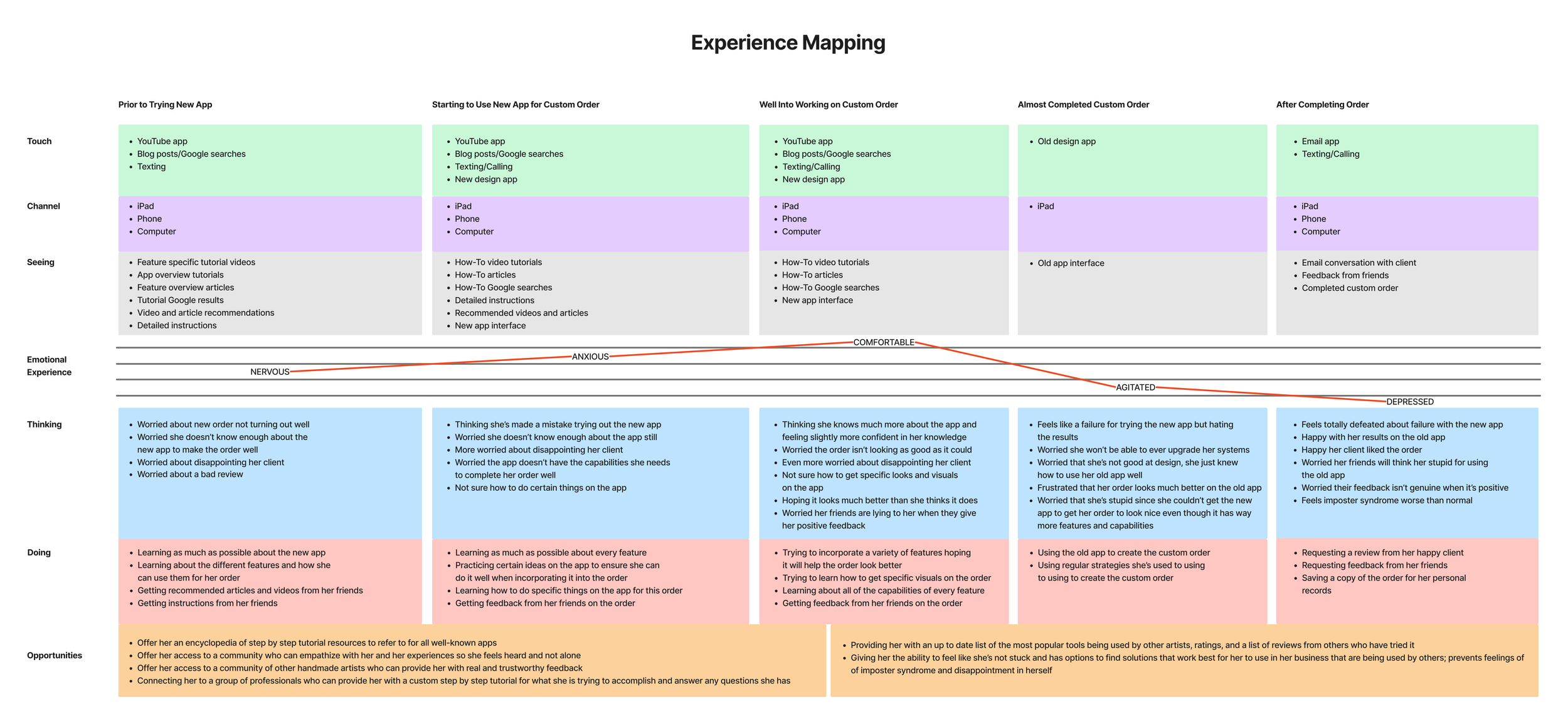
Experience Map
The experience Map was a fantastic way for me to get inside the mind of my persona and understand their behaviour and thoughts at any given time.
The Solution
To ensure I create a viable solution, I completed the following:
Task Selection
Sketching and Wireframing
User Interface Inspiration Board
Usability Testing
Task Selection
From the perspective of Janice, my persona, I created a series of user stories to help me develop my app’s features in further detail and ensure they meet the needs of my target user.
Once all the user stories were written, I went through them and grouped them into Epics based on common features/functionalities desired of the app.
Epics
Access to educational resources and recommended tools for running your business
View marketing analytics
Posting on social media easily and efficiently
AI generated content for social media posts within your micro-business’ industry
Ability to connect with other local creatives
Selected Epic
Posting on Social Media Easily and Efficiently
The steep and consistent learning curve and heavy time commitment of social media posting was one of the most common pain points that I discovered. This pain point also happens to be a significant one of my own as well - further compelling me to select it.
Task Flow Analysis
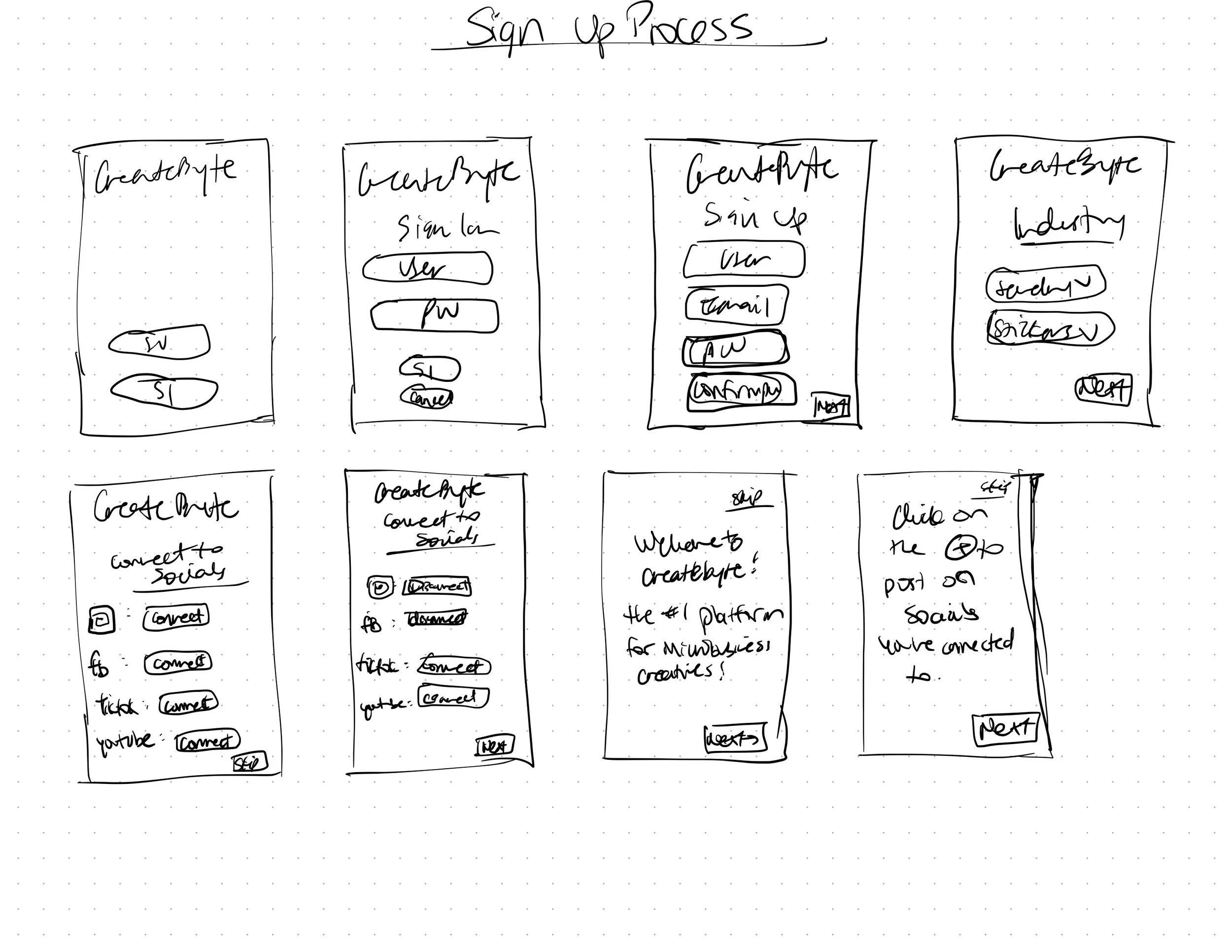
I created 3 task flows - one for signing up for an account, one for connecting to social media, and one for posting on social media. You can view them below.
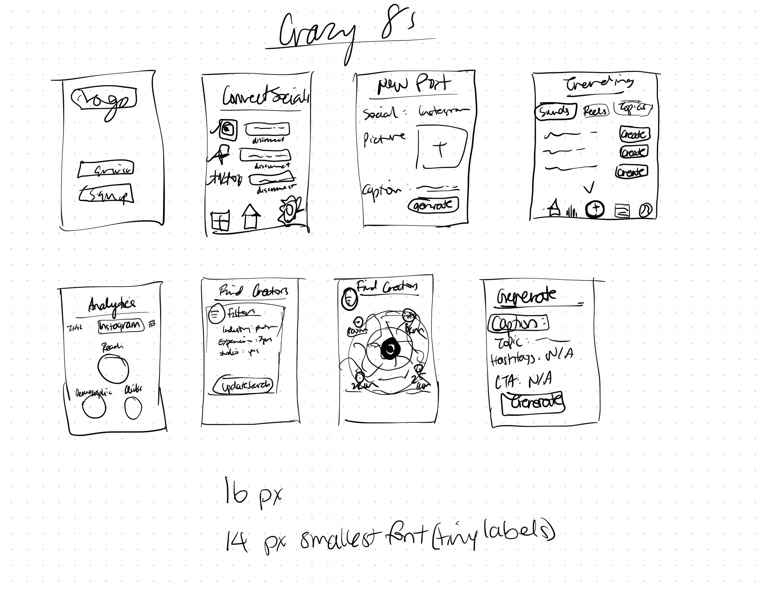
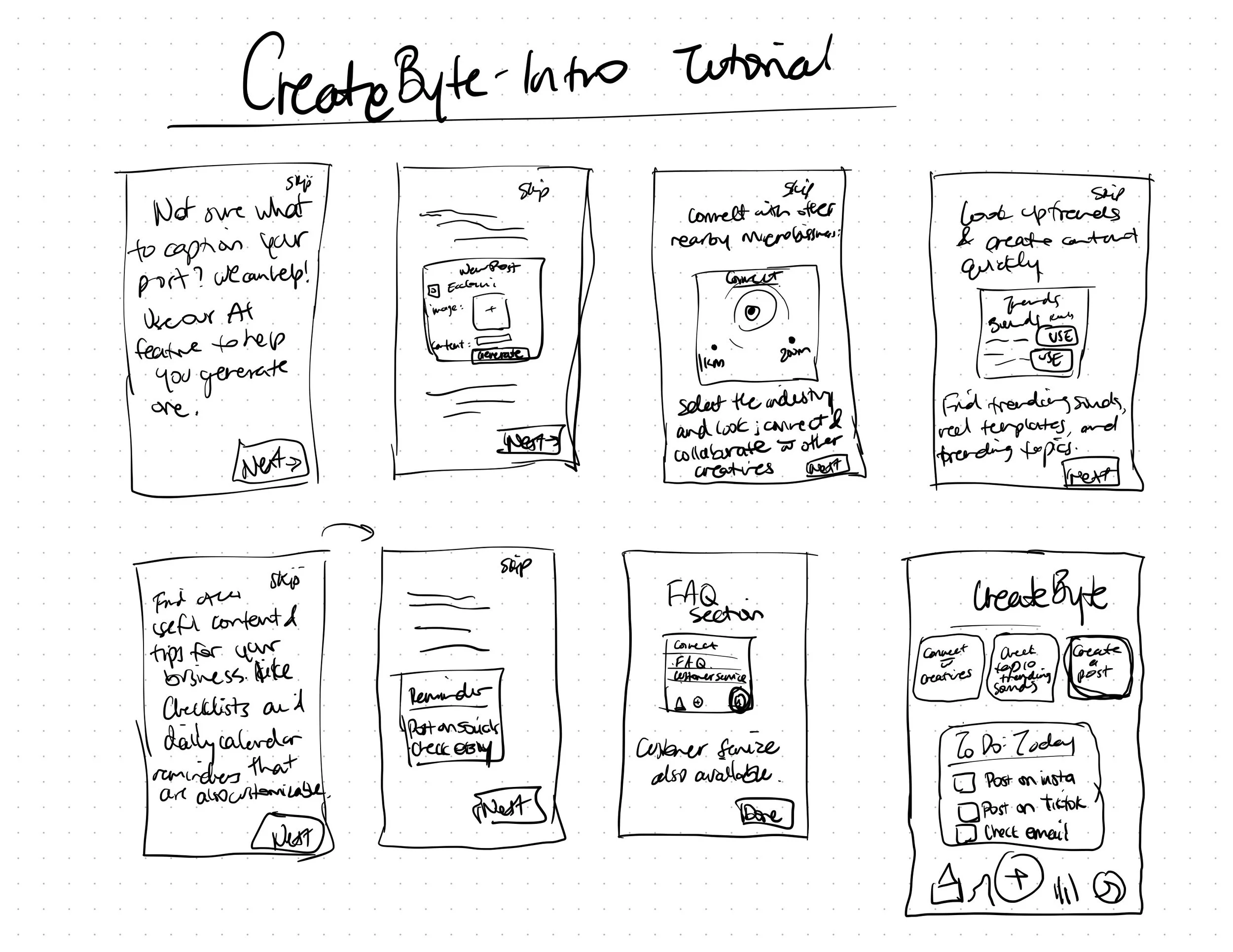
Concept Sketching & Ideating
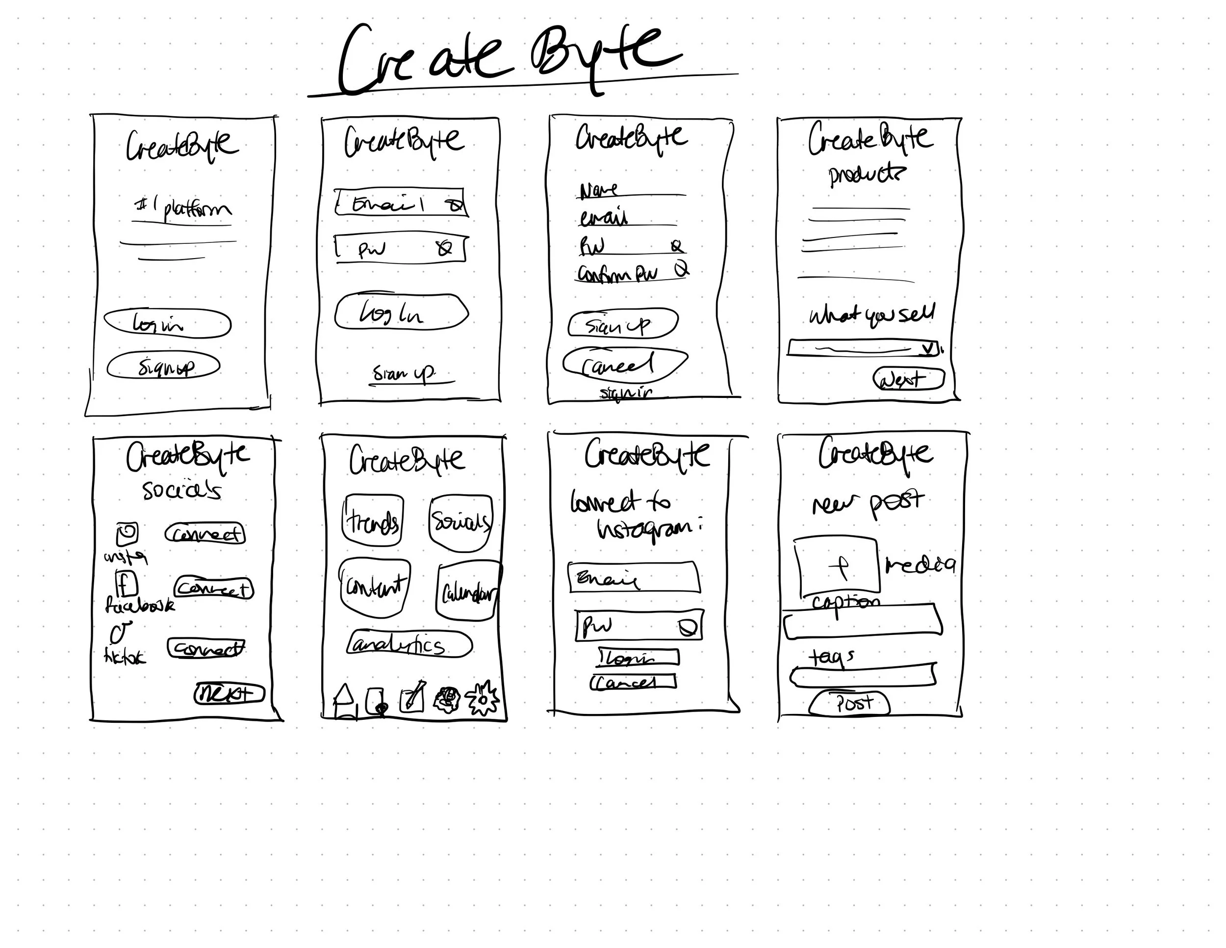
I used the Crazy 8’s method to create some initial sketches of the different features, and then I went through and created sketches of the Task Flows.
V1 Prototype
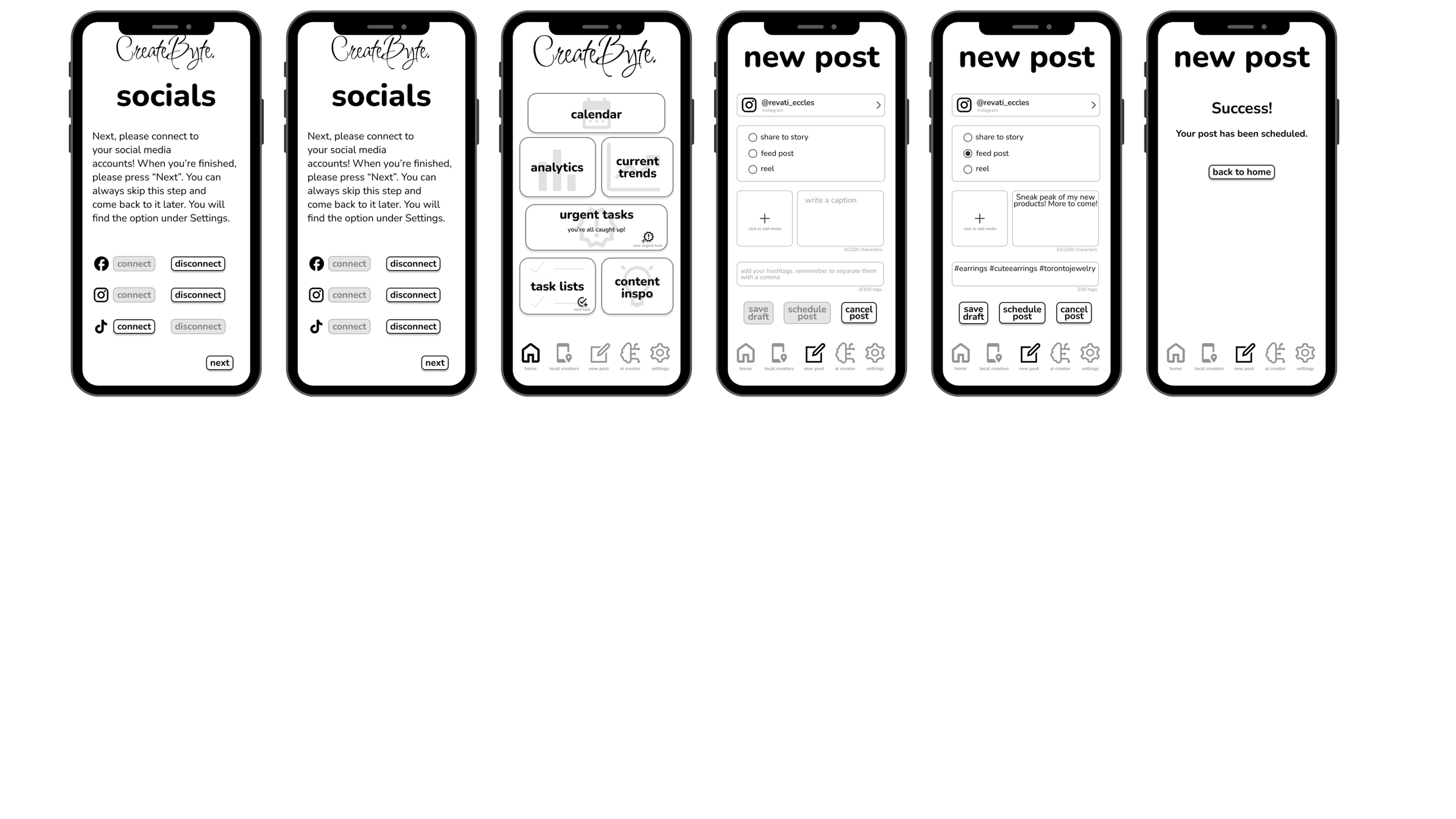
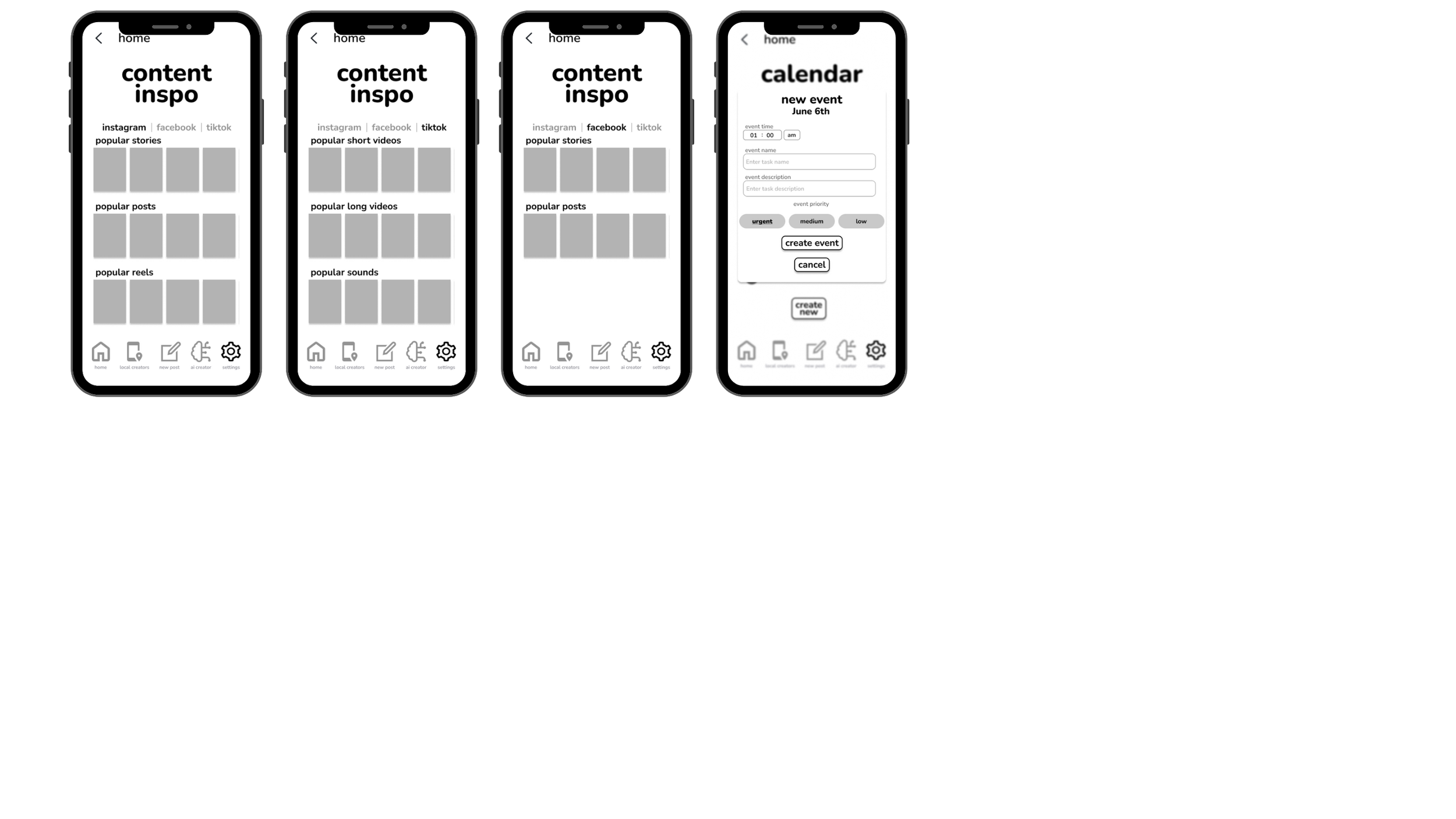
Once the sketches were complete, I created a working prototype for all three of the task flows that I had created. I began creating screens for all of the features I had included as well, even if they were not part of the task flow. The usability testing done with this prototype would give me an idea as to whether or not my solution was as intuitive as I believed.
Usability Testing
Round 1
Objective:
As part of the CreativeByte design process, we plan to conduct usability tests with 5 users in order to obtain practical, real-time feedback that can be incorporated to improve the design, in order to provide a more optimal and enticing user experience.
A single round of usability testing will be completed prior to implementing changes to the design based on user feedback.
Scenario:
New user:
• Microbusiness owner selling handmade items
• Sells their handmade items online – preferably on more than one platform
• Has an Instagram account dedicated to their business and has previously posted on their account with the intention of getting their products in front of more people
• Has used a minimum of one app or website with the purpose of saving time on admin tasks for their micro-business
Goal:
• To sign up and complete their account setup
• To connect the app to Instagram
• To schedule a post on Instagram
Design Prioritization Matrix
Most of the feedback that I received from the first round of Usability Testing were superficial changes that needed to be made - like the alignment of a page being slightly off.
On one hand, not having many substantial flaws is obviously a good sign for my product. On the other hand, had I gone through the prototype myself a few more times, I would have noticed these small errors and would have been able to correct them prior to the Usability Tests.
V2 Prototype
For the V2 prototype, I went in and adjusted the following:
fixed alignment on screens
fixed font inconsistencies
adjusted spelling and grammar
added iOS back tap icon
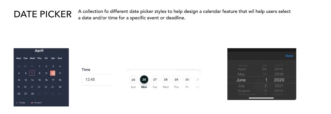
adjusted the states of some buttons added date picker overlay
added warning overlay
Usability Testing
Round 2
Objective:
As part of the CreativeByte design process, we plan to conduct usability tests with 5 users in order to obtain practical, real-time feedback that can be incorporated to improve the design, in order to provide a more optimal and enticing user experience.
A second round of usability testing will be completed prior to implementing additional changes to the design based on user feedback.
Scenario:
New user:
• Microbusiness owner selling handmade items
• Sells their handmade items online – preferably on more than one platform
• Has an Instagram account dedicated to their business and has previously posted on their account with the intention of getting their products in front of more people
• Has used a minimum of one app or website with the purpose of saving time on admin tasks for their micro-business
Goal:
• To sign up and complete their account setup
• To connect the app to Instagram
• To schedule a post on Instagram
Design Improvements
Most of the design improvements completed up until this point were minor adjustments to alignment, grammar, additional instruction/information in overlays, and additional status change notifications.
Creating a Visual Identity
Once I received feedback on the second greyscale prototype, I started ideating with regards to the look and feel of the brand.
Brand Identity
The target demographic is mid-20’s to mid 40’s who are attempting to expand the reach of their handmade micro-business.
They are familiar with social media and other digital tools, but find it time consuming and enjoy convenience.
Brand Adjectives
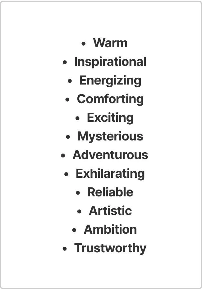
I came up with a list of adjectives to accurately describe the feel of my app. These words helped direct me when I began looking for visual inspiration.
This list encompasses all of the adjectives that I initially came up with that aligned with the brand in my mind. The bolded adjectives were the ones that aligned best, and so I used the bolded adjectives to help brainstorm the rest of the brand assets.
Final Brand Adjective Selection
Name Ideating
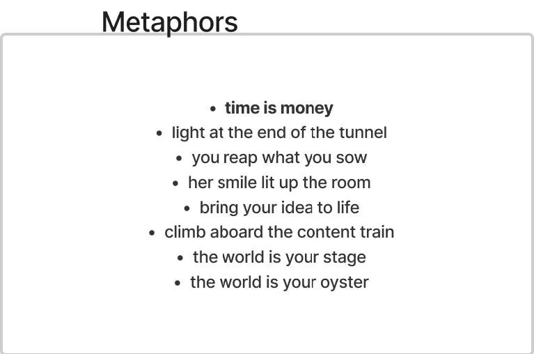
I actually began the name ideating process after I had come up with the How Might We question. I came up with metaphors and concepts that described my app. The bolded statement (“time is money”) is what I felt resonated with the brand and its purpose the most. I then used the adjectives, concepts and metaphors (keeping “time is money” top of mind) to come up with a list of potential brand names.
Out of all of the names I came up with, the name “CreateByte” stood out to me the most.
Moodboard
I created a moodboard to help me really get a feel and a sense of the best visuals to use.
UI Elements
This was the primary brand colour that I decided on going with. I wanted to make sure the brand colour was something that inspired trust and comfort.
I spent a lot of time looking into the psychology of colour theory. I found out that blue is associated with loyalty, trust, serenity, peace, and confidence. The darker, more navy-es blues were also known for communication and authority. A good example of a well-known brand that uses a blue like that is Facebook.
Wordmark Ideation
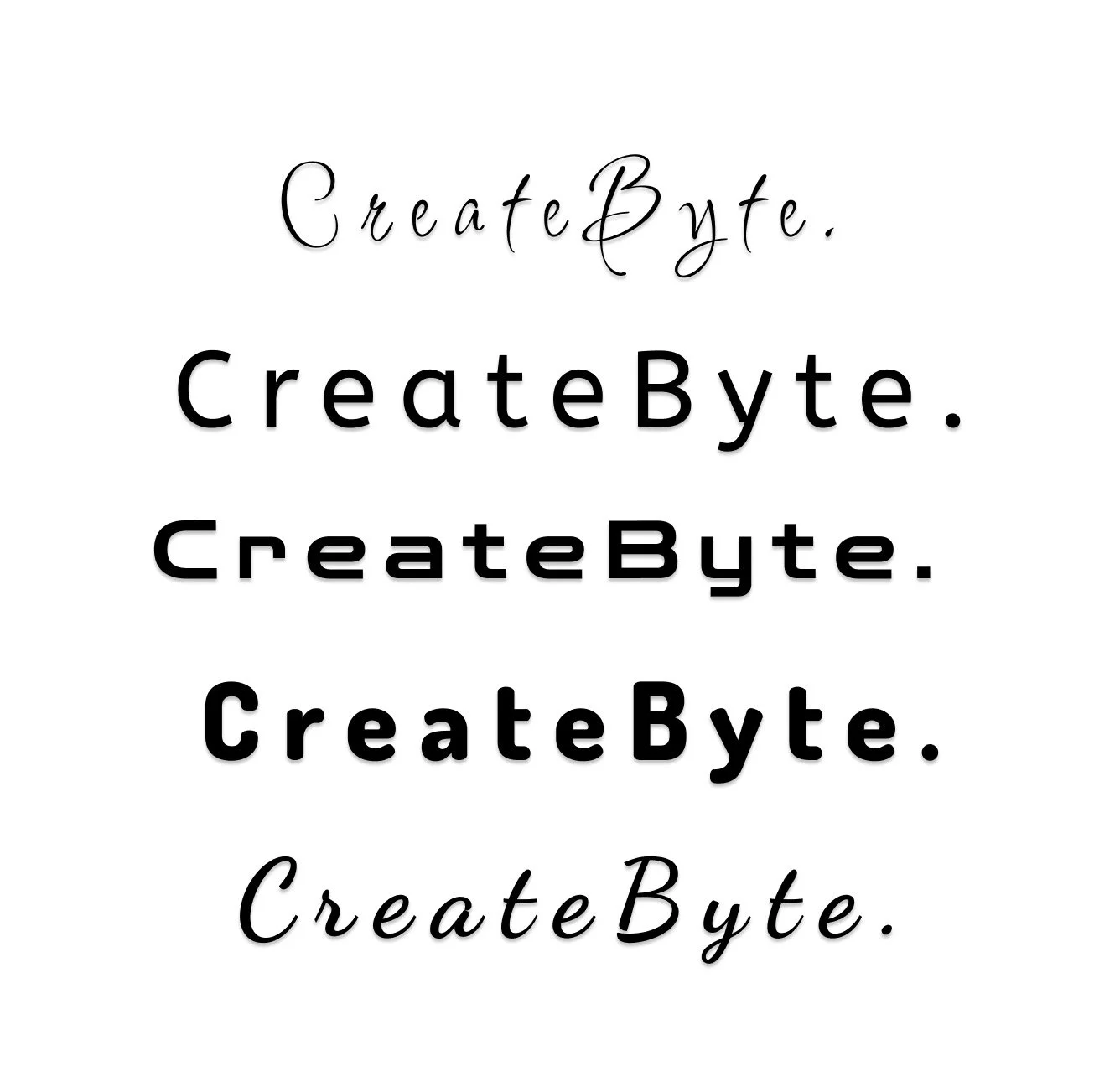
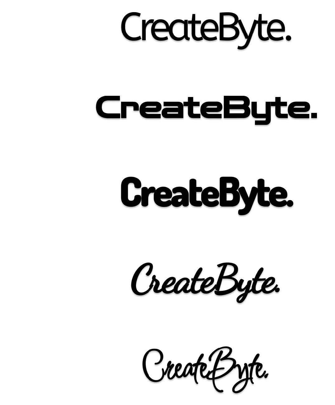
I began ideation process for the wordmark. I played around with typefaces, font variations, and punctuation. I went through many rounds of ideation until I found the wordmark that stood out to me the most and fit the best.
I had initially settled on one version of my wordmark and went through the ideation process again after creating the initial prototype because I no longer felt like it fit well.
Round 1
Round 2
During round 2, I increased the font size and tested different font variations (weight & styles). I also experimented with letter spacing.
Round 3
During round 3, I readjusted the font sizing, letter spacing, punctuation, and font styles.
Round 4
During round 4, I selected the 5 fonts that felt the most aligned with the brand. I explored further with these 5 specific fonts. Both the first and second wordmark I chose were from this final set.
4 a)
I selected the top 5 options from the first three rounds of ideation. The first option in this list was the wordmark first chosen and used in the low fidelity prototype. I initially picked it because of how artistic it looked. Upon further reflection, it reflects the artistic aspect of the solution well but not the technological side of the solution.
In the first part of round 4, I played with the drop shadow effect.
4 b)
In the second part of round 4, I played with letter spacing and kept the drop shadow effect.
4 c)
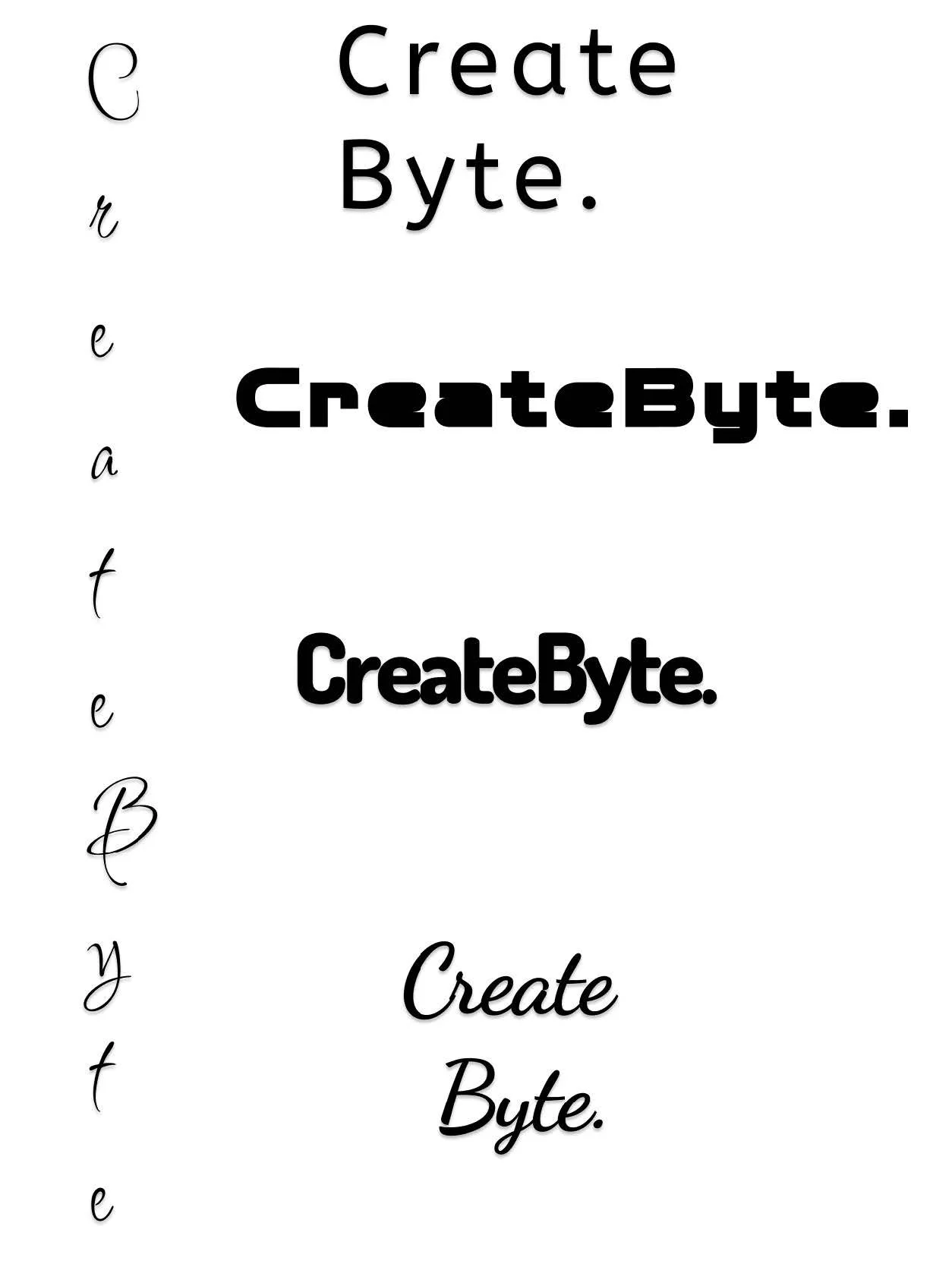
In the third part of round 4, I played with letter spacing, vertical letter placement, separating “Create” and “Byte”, word alignment, centre stroke, and the drop shadow effect.
The best choice was still unclear, so exploration was done again, but this time with each typeface on a separate art board.
Typeface: Dosis
Played with:
Letter spacing
Outside stroke
Center stroke
Drop shadow effect
All capitals
All lowercase
4 d)
In the fourth part of round 4, I played with the drop shadow effect, the centre stroke, and outside stroke.
Round 5
5 a)
Typeface: Dancing Script
Played with:
Letter spacing
Outside stroke
Center stroke
Drop shadow effect
All capitals
All lowercase
5 b)
Typeface: Inspiration
Played with:
Letter spacing
Outside stroke
Center stroke
Drop shadow effect
All capitals
All lowercase
5 c)
5 d)
Typeface: Zen Dots
Played with:
Letter spacing
Outside stroke
Center stroke
Drop shadow effect
All capitals
All lowercase
5 e)
Typeface: ABeeZee
Played with:
Letter spacing
Outside stroke
Center stroke
Drop shadow effect
All capitals
All lowercase
Final Wordmark
Original
Typeface: Dosis
Font: Extra Bold
Letter spacing: -%5
Final Wordmark Ideation
The first wordmark is the original Dosis wordmark. The second and third wordmarks are a result of elongating the letters and separating the letter outline from the fill.
Wordmark Vector Adjustments
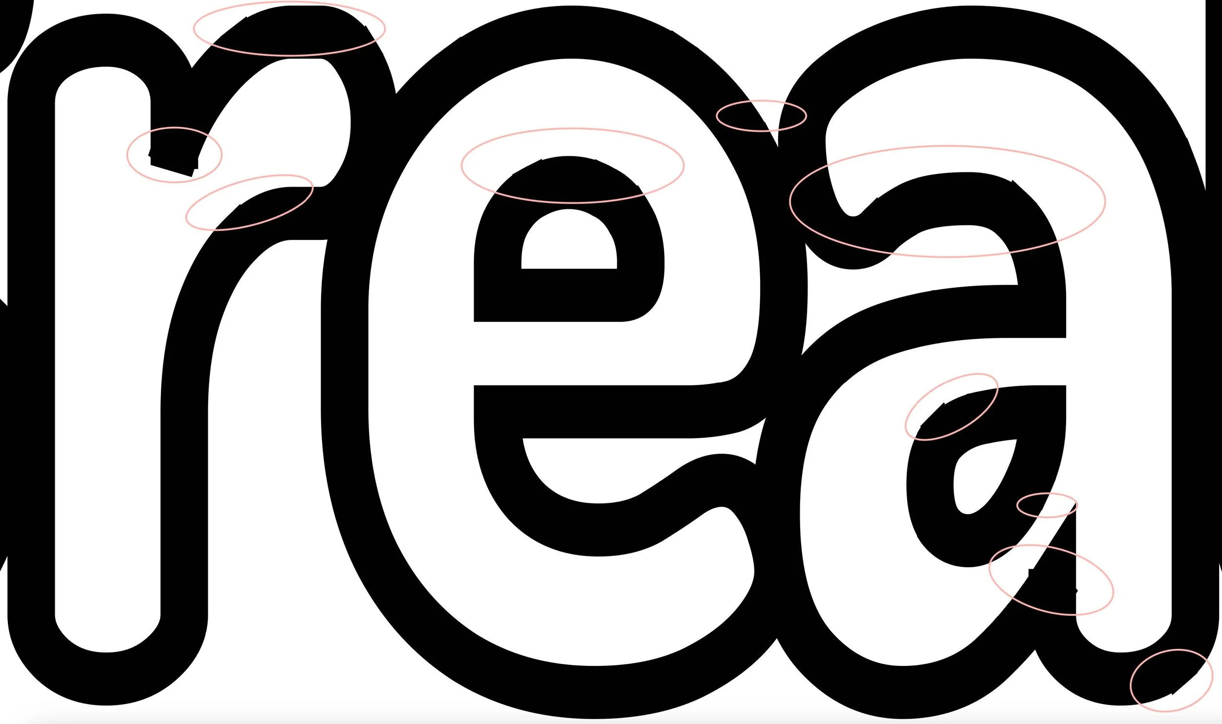
I made adjustments to the wordmark vector letters to personalize the branding further. I started by smoothing out all of the jagged edges of the “C”. All vector adjustments are circled in red.
I then made adjustments to the “rea” part of the wordmark. I smoothed out all the jagged edges of these three letters as well. All vector adjustments are circled in red.
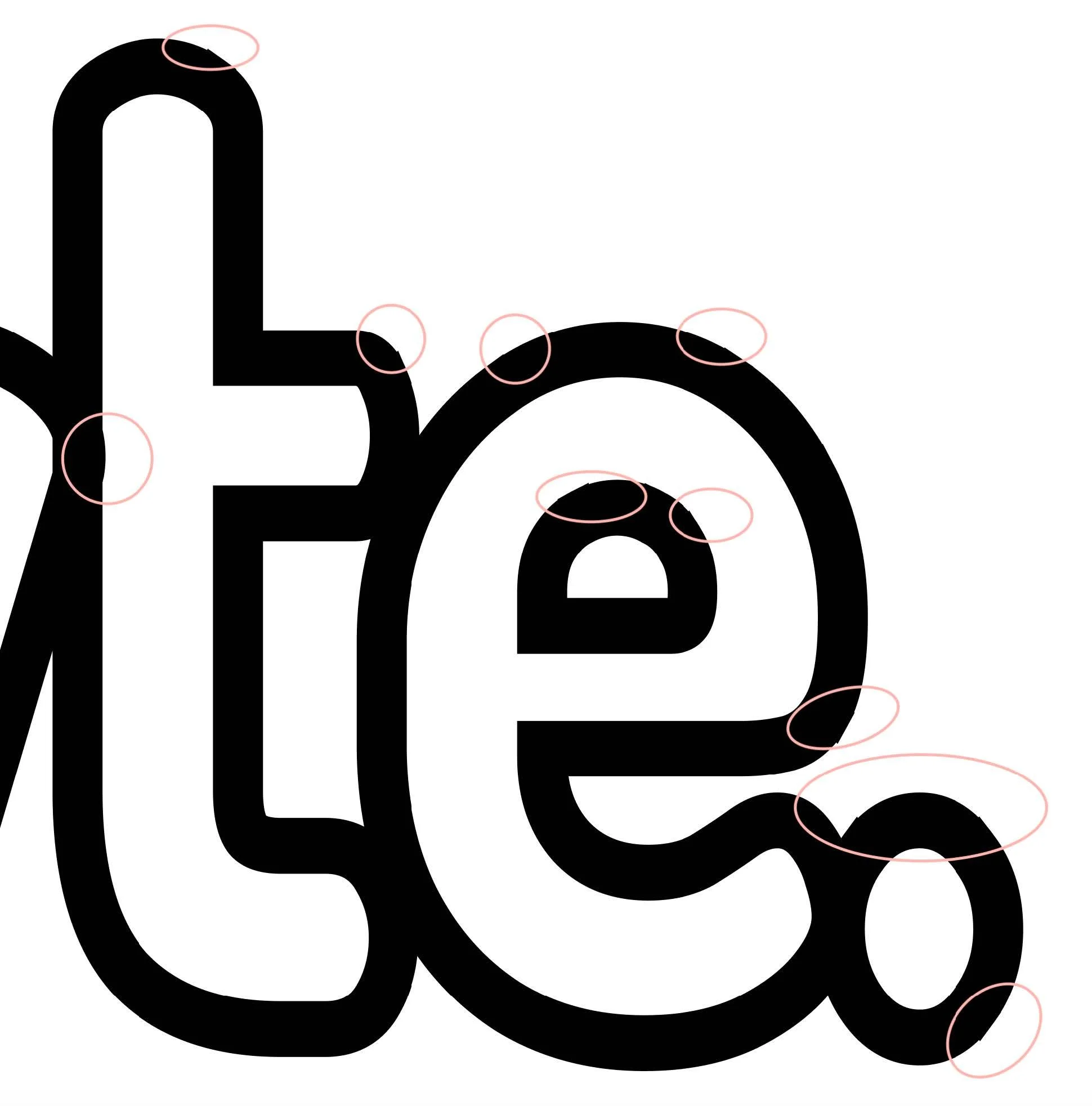
I moved onto the “teB” portion of the app. I smoothed out all the jagged edges of the letters, and I also bridged the gap between the “B” and the “y” (the “y” is not visible in this image). All vector adjustments are circled in red.
I bridged the gab between the “B” and the “y” (the “B” is not visible in this image). I smoothed out all of the hagged edges of the “y”, and I also fixed the overlap between the “y” and the “t” (the “t” is not visible in this image). All vector adjustments are circled in red.
I fixed the overlap between the “y“ and the “t” (the “y” is not visible In this image). I smoothed out all the jagged edges of the letters and the period. I filled in the period to make it solid instead of an outline, and I also adjusted the period’s shape to reflect a circle instead of an oval. All vector adjustments are circled in red.
UI Inspiration Board
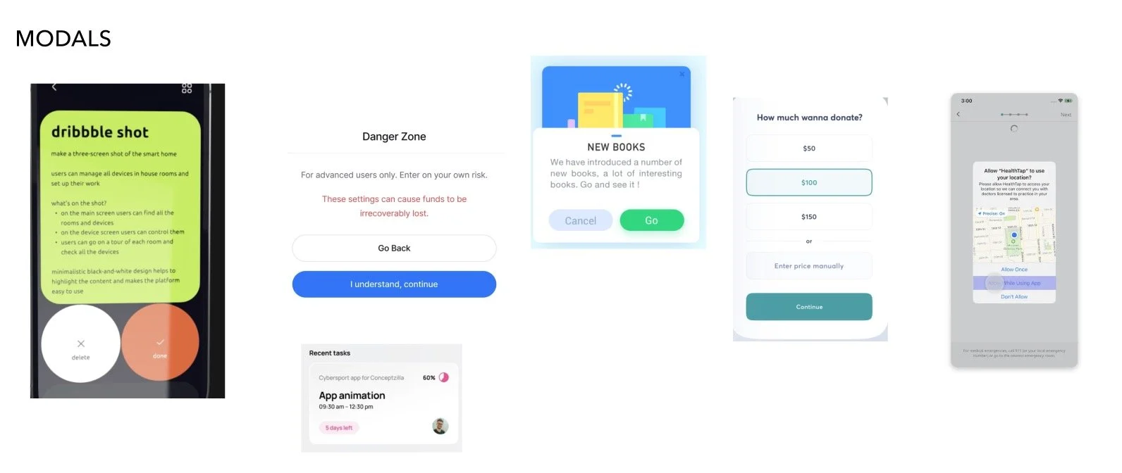
Before creating the High-Fidelity Prototype, I created a UI inspiration board to assist my visual design process.
V3 Prototype
Other than adding colour and the new wordmark to the design, I also completed the following changes and additions to the V3 prototype:
added a review and confirmation screen before you complete your social media post
“x” on the pills in the app now remove them
confirmation screen confirming successful connection to social media account was added
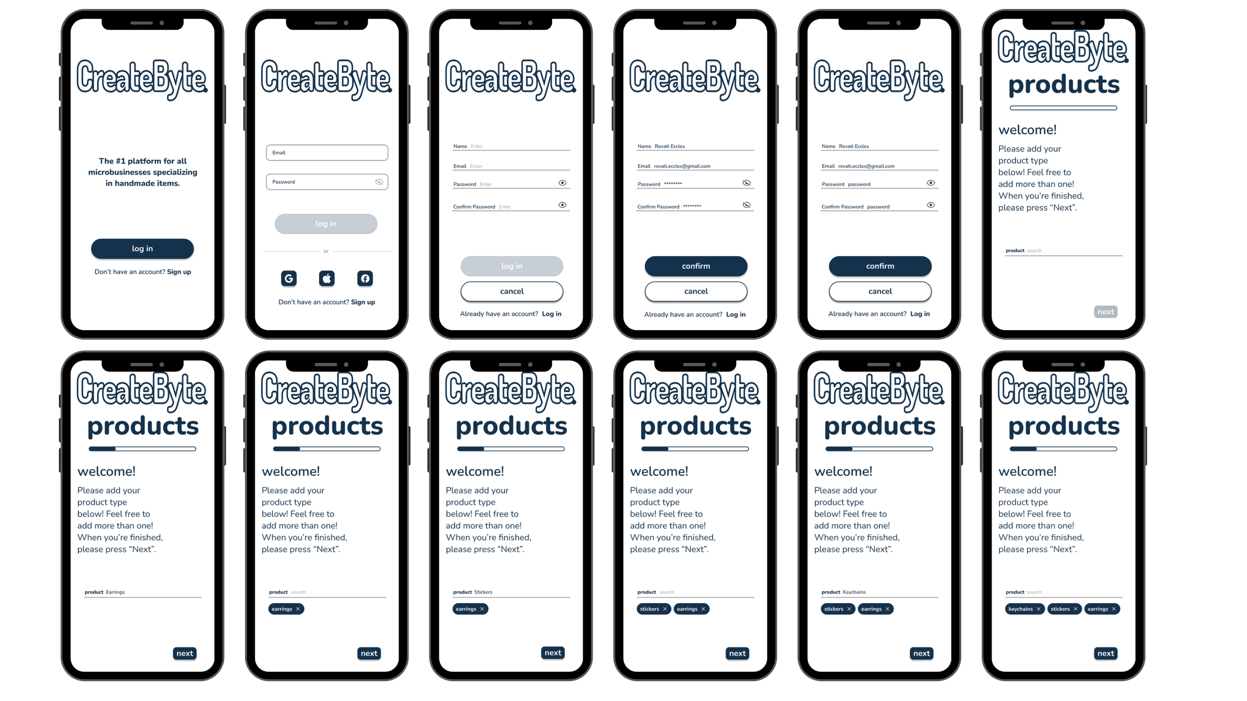
progress bar during account setup was added to keep the user appraised of how far along in the setup process they are
Registration Flow
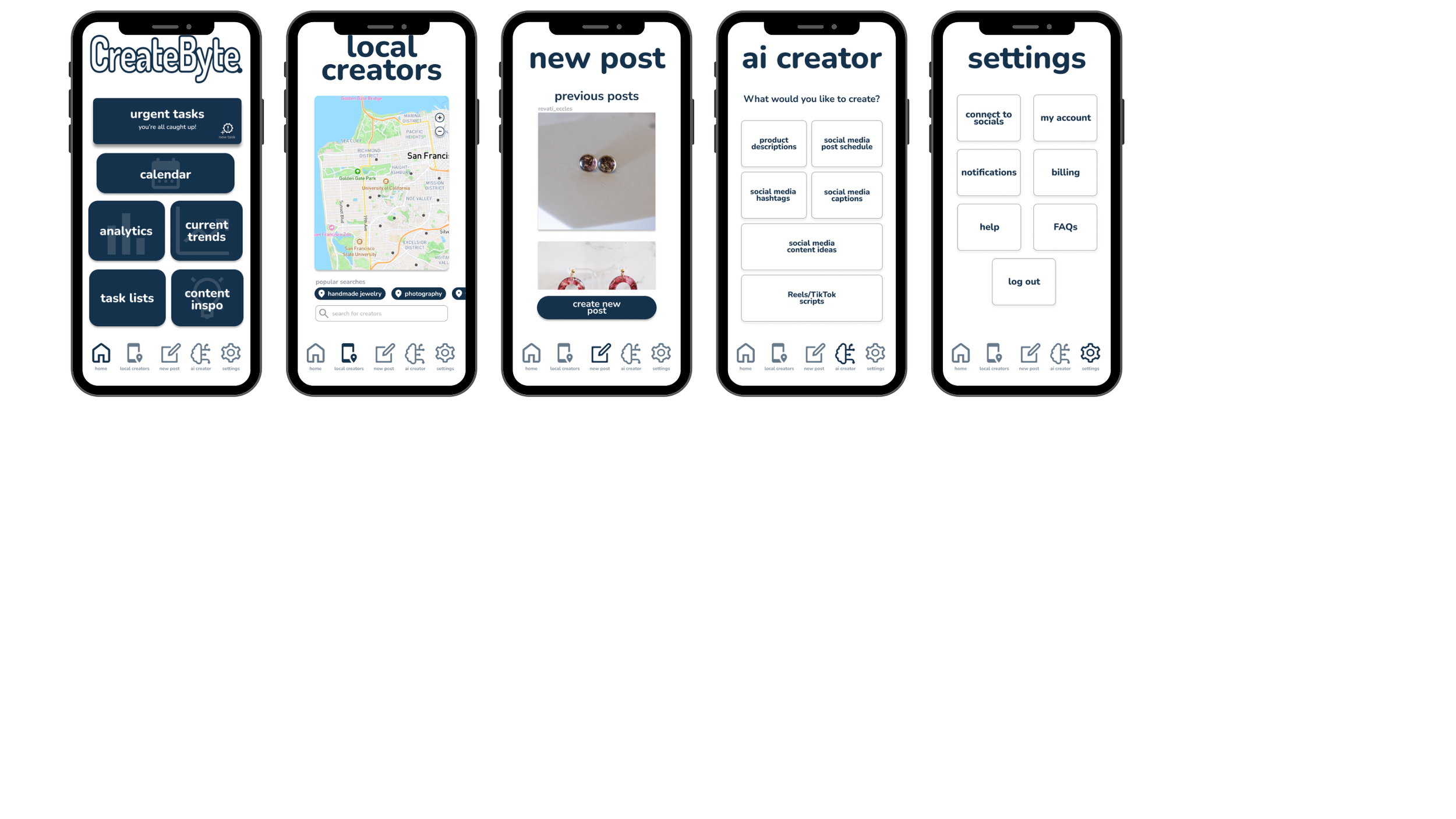
Main Menu Pages
Main Menu Buttons
Settings Page Buttons
New Post Flow
Marketing Website
One of the unique aspects of this design challenge was for us to create a marketing website for our app - for two different devices. I created a webpage meant for a desktop and a webpage meant for a mobile phone browser.
I have included a link to the prototype of the desktop marketing site as well as a link to the one for a mobile phone below.
Alternative Platform
One of the most interesting parts of this design challenge was designing a version of your solution for a different platform. I selected the Apple Watch as I felt that would provide me with the biggest challenge.
Having an Apple Watch myself, I know that with such a small screen, I would need to make sure I redesigned my app to only include a couple of features - and only ones that would work the most efficiently on the platform. Seeing as my solution focused on saving time and increasing one’s efficiency, I needed to make sure that translated into the redesign of the app for this platform.
This was the Apple Watch icon - I decided to keep the same one that I was using for the mobile application.
This was the app splash screen that I decided on.
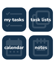
These are the 4 app features I kept for the Apple Watch rendition of my app. These are all features that tend to be time sensitive or used for time sensitive purposes (like leaving a note using voice command while on the go).
This is what you see once you tap on the “my tasks” card.
This is what you see once you tap on the “task lists” card.
This is what you see once you tap on the “calendar” card.
This is what you see once you tap on the “notes” card.
Key Project Learnings
The most interesting thing I learned from this project was how valued the human element to the app was. I expected the AI content generator to be seen as a high value feature, but I did not expect the feature connecting you with other local content creators to be considered one of the highest assets of the product.
I learned a bit about design as well. Many of the user interviews resulted in people pointing out alignment issues, even though that was not always the case. A few times they were actually pointing out the text boxes I had that were multiple sizes just by design. Because the difference in the sizes was not significant enough, it just looked like an error instead of a design choice. This reminded me that although alternative design choices can be looked upon favourably, it’s still very important to have discernible patterns as humans naturally look for them and gravitate towards them. If the human eye cannot recognize the pattern, it just looks like a mistake instead.
This project definitely helped increase my confidence as a designer. Being able to design a solution that is easy to understand without sacrificing functionality was a huge win for me.
Next Steps
One of the ideas that I did not consider was being able to repurpose the content that was posted on social media from the app to other platforms like Shopify and Etsy. To remedy this, I would actually add the option to be able to download the post (with or without the caption) after creating it (scheduling it, posting it, or even saving it as a draft).
The other feature that I did not consider was an internal social media platform of sorts where you could see the results of collaborations between different local creators. It would be a fantastic way of validating the creators and the validation of collaboration. When searching for a local creator to partner with, you would ideally be able to see content they’ve been tagged in/collaborated on when you click on their profile.


